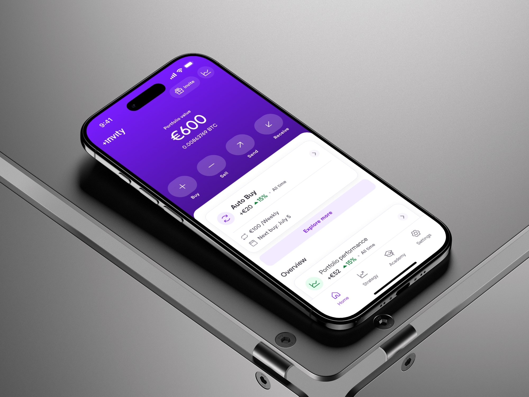
Cutting a step from every trade — without hiding the choice
In Trezor Suite, the desktop app for self-custody crypto, every trade ended with a manual pick from a payment-provider list. The Smart Engine now makes that pick — one step gone. I designed how the pick explains itself and stays overridable.
- Organization
 Trezor
- Role
- Product Designer
- Market
- Global B2C
- Timeline
- 2024–2025
Context
Trading inside a security-first tool
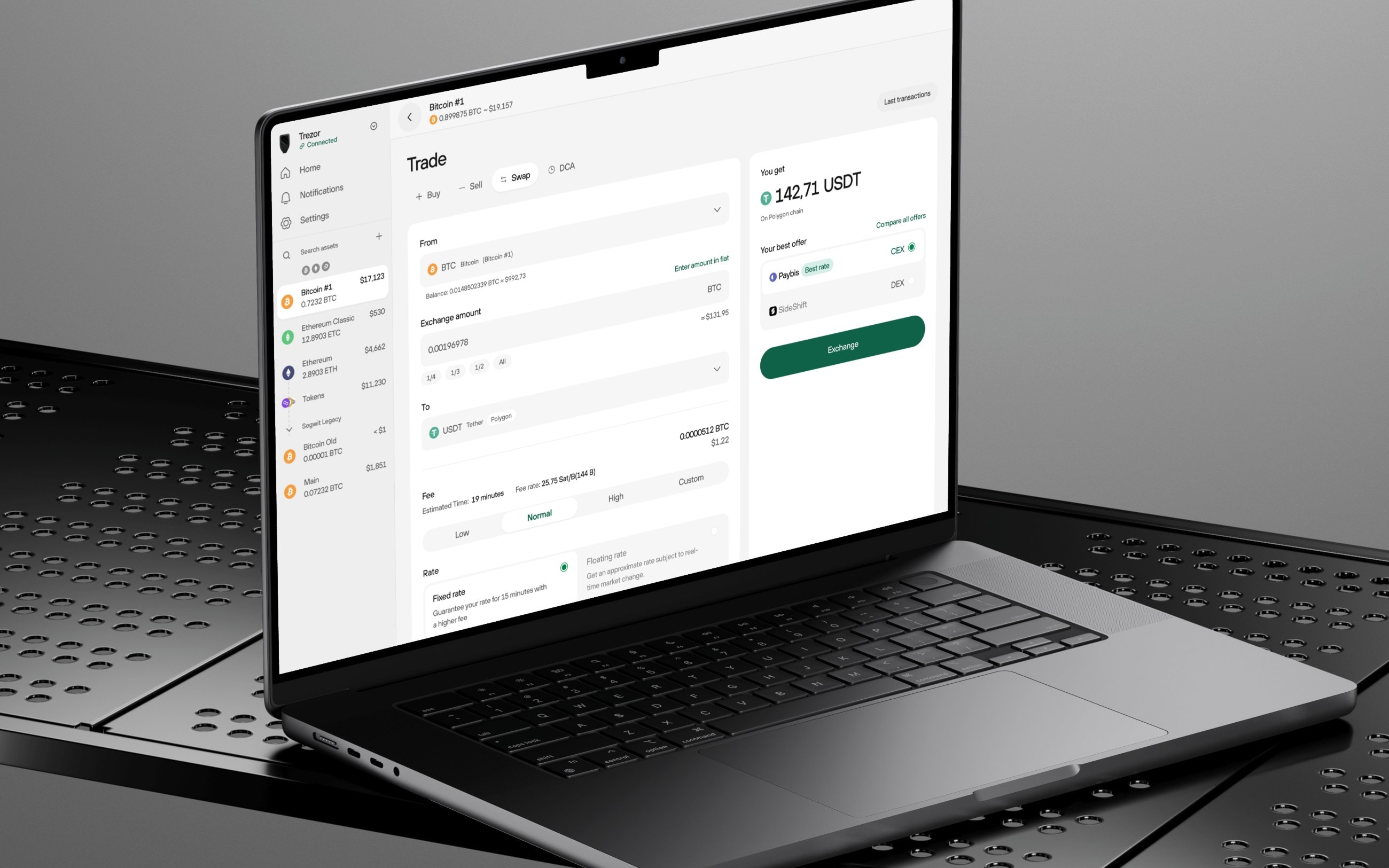
The product — Trezor Suite is the desktop app for managing crypto held in cold storage; its Trading section lets people buy, sell, and swap directly from Suite.
The audience — people who self-custody on purpose and value control over convenience. Built by SatoshiLabs.
The goal — make trading feel as trustworthy as the cold storage around it.
My role
Within the Trading team, the PM drove the research and made the product calls. I owned the design execution: how the pre-selection lands in the flow, how the pick explains itself, where the override lives — plus the token selector and provider cards, from concept to handoff.
Problem 1
A provider list between the user and every trade
Trading ran in three beats: set the amount, pick a payment provider from a list, confirm. The middle step was mandatory on every single trade — and it was all on the user.
Providers could quote materially different value for the same trade, and weighing them was work most people had little basis to do.
Solution 1
The engine picks first — one step gone
The Smart Engine now pre-selects a provider the moment the amount is set, ranked on a set of parameters — the weighting is part of the product's edge. What the user meets is the outcome: the flow is one step shorter, and the pick arrives as a single provider card instead of a list. My design work: how that pre-selection lands in the flow, and what the chosen card leads with.
One pattern, three trades. The engine's inputs are the form itself — amount, payment method, country for buys; asset, network, fee for swaps. Each trade type feeds it a different set, so the layout had to hold them all without changing shape: form on the left, the outcome on the right — what you get, the chosen provider, one action. Learn the screen once, and every trade reads the same.
Token selector with network filtering — the right asset on the right chain, without guesswork.
Provider cards, standardized — one comparable layout, so like is judged against like.
That removed the step. But for this audience, a pick made silently was the next problem.
Problem 2
Automation this audience is built to distrust
Self-custody users chose this product to stay in control. To them, a silent auto-pick doesn't read as convenience — it reads as a hidden kickback.
Any automation that decided for them, or hid its reasoning, would erode the exact trust the product is built on.
Solution 2
Reasoning visible, override one tap away
The engine never acts as a black box: it shows why the top pick won and keeps a one-tap path to pick any provider manually. For this audience, visible reasoning and the escape hatch weren't nice-to-haves — they were the feature. The product call came from the team; the form it takes on screen — the reason as one plain sentence, the override one tap away — was mine to get right.
First instinct — a silent auto-selection: just pick the best provider and move on. Faster, fewer screens.
The team's call — a transparent recommendation instead: surface the ranking logic, say why the top pick won, make manual override a first-class action.
The risk we took — a recommendation that explains itself is easier to argue with; we bet that for self-custody users, arguable beats invisible.
Result
One step shorter, still the user's call
Every trade is one step shorter, and nothing was taken away: the engine picks, says why, and steps aside on one tap. The hardest tradeoff was authority versus agency — how decisive the automation could be without ever deciding for the user; legible reasoning let it be confident without being controlling.
What I'd do next — let users tell the engine what “best” means to them (cheapest vs. fastest), without reintroducing the complexity we removed.
Measured by — the share of trades completed through the recommended provider, and trade completion overall. The numbers are tracked internally and aren't mine to share.